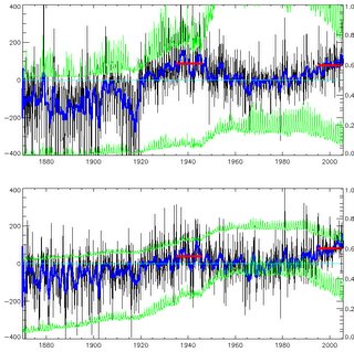
 I'm sure you can guess the answers, and its "no" to both. Have a look at my pic (but be careful, there are lots of lines...). The top graph is [70,90]. The bottom graph is [60,90]. Both show the area-averaged temperature anomaly (in black; the 13-month running mean is in blue) from the HadCRUT2v dataset, in 100's of oC, which is why the left hand scale is 100 times bigger than you think it ought to be. Both plots have the same general shape, but for the wider area the current (last 10 years, mean given by red bar) temps are higher than for the 1935-1945 average. But even for [70,90] the temps in 1935-45 are only marginally higher than now - about 0.1 oC - hardly "much higher than today" as our septic claims.
But... look at the green lines. The lower green line on each plot is the fraction of the area covered by obs, on the right-hand scale. So for [60,90] about 40% of the area is observed, since 1960. In the 1940's, about 30%. For [70,90] about 20% is observed, recently (though with a huge annual cycle: far more people about in summer!) and less than 10% in the 1940's. Our septic complains that the "Arctic Climate Impact Assessment (ACIA) start their temperature records in 1960". Errm yes, well that might well be a good idea. Perhaps the ACIA people actually bothered to look at the data rather than just area-averaging it.
In fact, to my not-great-surprise, the ACIA people do indeed look at temperatures before 1960 (hint: if a septic sez something is true, its probably false...) and even draw nice maps of the trends at various time intervals: see the ACIA sci report, p36 and after. But they note the data sparsity problems early on.
The total *number* of filled 5x5 degree gridboxes is the upper green line on each plot, and the scale is (conveniently) the [0,400] of the upper half of the temperature scale (has your mind exploded yet?) *except* that for [70,90] that would be too small to see so I've multiplied it by 10 (boom!). So at the time of that huge (and rather suspicious...) jump in the upper plot at 1919, there were only 5 (=50/10) stations. For [60,90] there are nearly 200 filled boxes, recently.
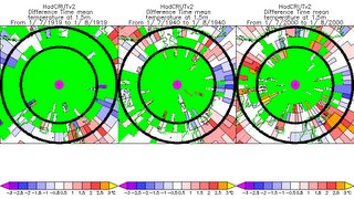
 Just looking at fraction-of-obs can be a bit dry, so here are maps of gridboxes filled (with their anomaly values, no in sensible units) for July 1919, 1940 and 2000. Note that using July maximises the filled boxes for the year. Its pretty obvious that 1919 is *very* sparse; 1940 is sparse; but even 2000 isn't exactly packed, north of 70; though its pretty good from 70 to 60 (oh, the black circles are 60 and 70 N, of course).
So... what do we learn from all this (apart from never trust the septics, but we knew that already)? We learn that plucking a dataset off the shelf and playing with it and only showing the end result may well mislead... we learn that you should be cautious with sparse data.
I am surprised that there are essentially no measurements inward of 70. I would have thought that the US and Russian (nee Soviet) navies would have spotted the place with automatic stations.
ReplyDeleteEli - Keeping an AWS working above 70S was probably pretty tricky in the old days. Easier now; but probably the answer is that the actual temperature wasn't so important to the military: they were far more interested in submarines under the ice.
ReplyDeleteI would not bet against there being several sets of records south of the Potomac near Washington and somewhere near Moscow. Getting this stuff out from under various security blankets would be tough, but worthwhile.
ReplyDeleteNice little post William. Your graphs show your point very well.
ReplyDeleteJohn
Of course William, if you're desperate for warming then why not include those nice Siberian weather stations whose anomalous warming has abosutely nothing to do with the fact that they are near growing towns and cities?
ReplyDelete"60-90 is more usual" - I must add that to my list of weasel expressions for cherry picking.
John A - as a comment on my analysis, that was pathetic. Come on, have you nothing to say? In which case, why not say nothing?
ReplyDeleteWhat analysis?
ReplyDeleteYou present diagrams of the data showing sparsity of observations but no discussion of the known problems of including problematical data points such as the set of Siberian stations between 60 and 70N which show anomalous warming?
Like your friend Mann, you're playing a shell game. In Mann's case it's "watch the bristlecone pines", and in yours its "watch the Siberian stations with their known large UHI errors and the systematic errors in most Arctic Russian towns caused by the reporting of lower temperatures during the Soviet era so that they'd receive more fuel and food from the Kremlin"
Presenting diagrams without provenance and ruminating about "the wilder shores of skepticism" does not an analysis make.
Perhaps you'll revert to your favoured tactic of verbally yawning and stretching, having some of your acolytes believe in your intellectual prowess that is so taxing that you can barely keep your eyes open while responding to the pinpricks of those Lilliputian skeptics.
*yawn*
"John A has responded to my blog article and has besmirched my scientific reputation in the eyes of my true believers"
*stretch*
"Well I suppose I'd better do something, shall I go for overweening arrogance or just feigned boredom and trivialisation?"
*flips coin*
"It's landed on its edge! Again! What are the chances?"
John A: O woe is me! Connelley's reaching coffee jar and this time its not the decaf! My doom is nigh!
For an actual peer-reviewed article on Arctic temperatures see:
Polyakov, I., et al., 2002. Trends and Variations in Arctic Climate Systems. EOS, Transactions, American Geophysical Union, 83, 547-548.
Polyakov, I., Walsh, D., Dmitrenko, I., Colony, R.L. and Timokhov, L.A. 2003a. Arctic Ocean variability derived from historical observations. Geophysical Research Letters 30: 10.1029/2002GL016441.
Polyakov, I.V., Alekseev, G.V., Bekryaev, R.V., Bhatt, U.S., Colony, R., Johnson, M.A., Karklin, V.P., Walsh, D. and Yulin, A.V. 2003b. Long-term ice variability in Arctic marginal seas. Journal of Climate 16: 2078-2085.
Polyakov, I., Alekseev, G.V., Timokhov, L.A., Bhatt, U.S., Colony, R.L., Simmons, H.L., Walsh, D., Walsh, J.E. and Zakharov, V.F., 2004. Variability of the Intermediate Atlantic Water of the Arctic Ocean over the Last 100 Years. Journal of Climate 17: 4485-4497.
John A: " Of course William, if you're desperate for warming then why not include those nice Siberian weather stations whose anomalous warming has abosutely nothing to do with the fact that they are near growing towns and cities?"
ReplyDeleteCan you give some examples of Siberian weather stations [b]north of 60 degrees[/b] that are warming anomalously due to the fact that they are near growing towns and cities? Your link didn't provide any.