2005-11-29

Reading the entrails: New Nukes?

The BBC says:

Blair says nuclear choice needed

Tony Blair says "controversial and difficult" decisions will have to be taken over the need for nuclear power to tackle the UK energy crisis.

The prime minister told the Liaison Committee, made up of the 31 MPs who chair Commons committees, any decision will be taken in the national interest.

He is said to believe nuclear power can improve the security of the UK's energy supply and also help on climate change.

A government review of energy options is expected to be announced next week.


I like the any decision will be taken in the national interest. This fails the try-negating it test: any decision will be taken against the national interest is unsayable. So ItNI means "prepare for an unpopular decision".

Although there is always a techno-industrial lobby in favour of Nukes, I'd guess that and also help on climate change may be quite accurate. Blur has been talking about Kyoto options and as I noted I think the govt has realised we're (they're?) not going to hit our targets. So he needs to pull something out of the hat. These nukes won't do it: they won't be onsteam by 2012 unless they arrive rather fast; but they could probably be folded into the plans if pushed.

So... is this a runner? Lots of people don't like nukes: Greenpeace protesters have disrupted a speech used by Tony Blair to launch an energy review which could lead to new nuclear power stations in the UK. Two protesters climbed up into the roof of the hall where Mr Blair was due to address the Confederation of British Industry conference. After a 48-minute delay, Mr Blair made his speech in a smaller side-hall. Forcing Blur off into a side-hall is a success, and will have annoyed him a lot.

But the "debate" about their (de)merits is as poor as ever: at least judging from radio 4 this morning. We had someone who doesn't like nukes, and then Bernard Ingham who does (I think, like Bellamy, out of an unstated assumption that its Nukes or Windfarms and he doesn't like windfarms). The green chap said Nukes are uneconomic; BI said they are. I rather suspect that they aren't, under current conditions: our present Nukes barely manage to stay afloat even with all their building costs written off; and I don't see piles of commercial applications waiting to be built. Of course some of this is due to the endless wrangling which costs; and how to cost the long term storage is obviously a bit of a poser since no-one yet knows how it will be done.

One of the arguments that the Green side is starting to push is that Nukes aren't that good for CO2: that over their lifecycle, they emit lots, comparable with coal/gas. I rather doubt that makes sense. I've never seen the figures. If it *is* true then it would account for the economics being so bad. If anyone has them, do please leave a comment.

You'll have noticed that I haven't explicitly given my opinion on this, though which side I lean should be clear enough. I excuse this by it being far from my expertise: I'm not sure why you should want my opinion. If offer this observation, though: that through the years on sci.env I have observed that the people in favour of Nukes invariably know more about them, and those against know little. Blur is likely to be an exception to this, though.

Sea ice: what I do in my spare time

Fairly soon now I'm off to NZ (oh dear, my CO2 burden...) to present some sea ice work. The poster part of it is nz-hadcm3.pdf. I have a day or two left, so feel free to point out typos and gross scientific errors.

The theme of the work is upgrading the sea ice dynamics in HadCM3, which has occurred just in time for it to be replaced by HadGEM. Never mind, we learnt a lot in the process. Mostly we learnt how hard it is to force the sea ice to behave itself in a coupled model.

The poster (in theory) says it all, so I won't explain at length here: but feel free to ask questions...

2005-11-28

Topping Punts

There is an air of "tipping points" about. This is an idea (possibly coined by Schellnhuber) where "the balance of particular systems has reached the critical point at which potentially irreversible change is immenent, or actually occurring". That quote, somewhat bizarrely, comes from the Books and Arts section of Nature (here), which is a slightly dodgy regular section where they make a feeble stab at pretending the "two cultures" ever talk to each other.

And so the piccy is S's attempt to find an "icon" for climate change. But (ibid) "the issues surrounding climate change are extraordinarily complex. Can an image be found that is both simple and good science? Given the contentious nature of the debates, particularly in the United States, it is unwise to offer hostages to fortune by parading vulnerable predictions". I don't think the image is simple: is it good science?

But first of all, what about the "tipping points" concept anyway? I've previously pushed the idea that the climate is stable (in the absence of perturbation). You could argue, quite plausibly, that we shall soon have emitted enough CO2 to raise the T enough that we will be committed to melting Greenland. Perhaps that counts as a tipping point. But its slow. Its on the map as "instability of the greenland ice sheet" which is an odd way of phrasing it but has the "virtue" of implying speed.

But enough quibbling. The one I reacted badly to was "Antarctic ozone hole". Its an envoronmental icon, but hardly a tipping point: as far as its known its reversible, and on a long slow trend to being reversed (err, as long as GW doesn't cool the stratosphere too much...).

As to all the rest... I dunno, its a bit vague isn't it? I'm not sure I'm too keen on this search for an icon stuff.

A couple of BTW's to finish off: (1) I'm down to wiggly worm, so it looks like status is based on snapshot rather than accumulated - must get posting again. (2) I'm off conferencing for a while at the end of the week, so will be dropping further down. (3) I may get assimilated by the Borg in the near future anyway... Mark seems to have self-assimilated.

2005-11-26

The Parker Paper

The Parker UHI paper (see [[Urban Heat Island]]) from Nature 2004 (and the Peterson 2003) strengthens the TAR contention that the UHI isn't important; and perhaps negligible. Now RP Sr has taken a shot at it. Unfortunately his paper is... difficult. You can take his word for what it says if you like, but I'd rather not. Happily, RP is so confident of his position that he has followed up with a whinge about Nature rejecting him, which includes the reviewers responses: Pielke has failed to adequately assess whether there are any trends in windiness in the Parker data set. Parker stratified by wind conditions, both at rural and urban sites, so any trends in windiness (even if this were possible in a stratified data set) would occur both at rural and urban sites. To suggest that there would be different turbulent mixing at rural and urban sites would then require differences in trends in temperature to be found, which is exactly what Parker found not to be the case. The logic presented in Pielke’s comment is circular and incorrect is the briefest.

One day I may actually read it, or meet someone who has. Until then I don't have a good way to assess it.

2005-11-25

Its cold and Scott Adams gets whacked by Dogbert

Today we had the first (and who knows, maybe the only) snow of winter. Just a flurry; nothing settled, sadly.

Meanwhile, although I really like Dilbert, it looks like Scott Adams needs a whack from Dogbert to chase out the demons of stupidity aka ID/Creationism: via some rather circuitous routes I found Stein and Wolfgang.

And while I'm here, there is nice blog starting by Robert Friedman about his trip to the South Pole. Take the virtual tour!

Grauniad: Sea level rise doubles in 150 years

Yes, back to the familiar old topic: bashing science coverage in the papers. This time that old lefty favourite, the Grauniad, which has an article on Sea level rise doubles in 150 years. Who have discovered that Global warming is doubling the rate of sea level rise around the world... The oceans will rise nearly half a metre by the end of the century... Scientists believe the acceleration is caused mainly by... fossil fuel burning... during the past 5,000 years, sea levels rose at a rate of around 1mm each year, caused largely by the residual melting of icesheets from the previous ice age. But in the past 150 years, data from tide gauges and satellites show sea levels are rising at 2mm a year.

To which the obvious reply is "is this supposed to be news"? Slightly garbled of course (satellites say 3mm/y; the longer time tide gauge record is ~2 m/y; see the wiki [[Sea Level Rise]] page and the refs to the IPCC therein). The other interesting bit of garbling is the 1mm/y over the last 5kyr... the TAR says Based on geological data, global average sea level may have risen at an average rate of about 0.5 mm/yr over the last 6,000 years and at an average rate of 0.1 to 0.2 mm/yr over the last 3,000 years. So, *if* they haven't garbled it, they story is that the folk from Rutgers University have upped the estimates of SRL over the last 5kyr. But I'd bet on garbling myself. The abstract from Science is here but I can't read the full contents (I had an offer of a subs for $99/y and am considering taking it up...) but it seems to be more interested in the Myr timescale.

The Grauniad also covers the latest EPICA stuff, but thats much better covered over at RC so you should go there for that.

[Update: thanks to the kindness of not one but two readers, I now have a copy of the article from Science. In true blog style, I've quickly skimmed it far enough to discover that the 1 mm/y over the last 5kyr is a bit of a sideshow, and fortunately for you, its in the supplementary online material freely available. They say "Sealevel rise slowed at about 7 to 6 ka (fig. S1). Some regions experienced a mid-Holocene sealevel high at 5 ka, but we show that global sea level has risen at È1 mm/year over the past 5 to 6 ky." So I must apologise to the Grauniad: no garbling.

So how do we reconcile that to the pic I show (which is from wiki, not the Miller paper)? Both show a rise of about 15m over the last 8 kyr. The wiki pic has that very steep (15 to 4-) from 8 to 7 kyr; then much shallower. The Miller article fig S1 starts a bit deeper and has a much more uniform slope. Since the Miller data is almost entirely from one area and appears to contradict what I think I already know, I'll stick with wiki and the TAR for now. But informed comment is welcome. I do find it a teensy bit surprising that the Miller paper doesn't comment on the discrepancy between their Holocene results and "accepted wisdom": its possible I have the AW wrong.

Update 2 (minor): switch href on the figure to the wiki page]

2005-11-23

Stability in a control run of HadCM3

One of the things I do is port [[HadCM3]] to new platforms (although I shouldn't over emphasise my role in that: much of the hard work of portabilising it was done at the Hadley Centre; nonetheless new platforms throw up new problems). HadCM3 was written for a Cray T3E; its known to be stable when run without forcing for thousands of years on that platform. There is a portable version of the model, which requires a little bit of effort to make it run on new platforms. The first thing to do is make it compile; the second to make it run through the first timestep; the third through the first meaning period; and then hopefully all that remains is to check that it is stable.

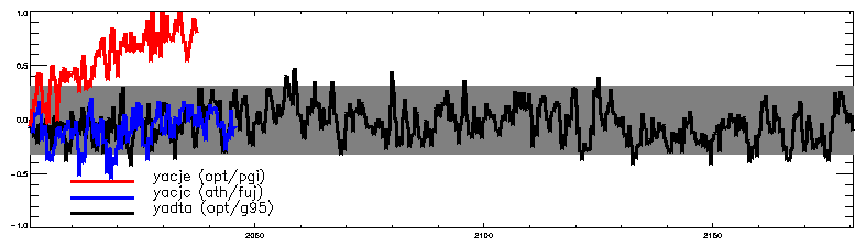
Which brings in this picture. Black is a 200 year control run, with the g95 compiler on a 4-processor Opteron system (using 3 procs for most of the time). Blue is a rather older run on an Athlon system under the antique fujitsu/lahey compiler. Red is an in between run on Opteron with the Portland Group compiler (pgi). All are seasonal data, differenced from 100 year means of an "official" control run. What you'll notice is that the red run has a distinct climate drift, which is enough to make it unusable. Blue looks OK; black has been run out long enough to be sure its OK. The grey shaded bit is some kind of 95% confidence limit based on the variability of the 100 year "official" run.

Quite why the Opteron/pgi runs drifts I don't know. Its 99.999% the same code as the other runs (differing only in whatever it took to make the compiler accept it). Most likely there is some compiler bug in there; but I will probably never know.

By eye, the 200 year run has no drift. By line fitting, the results are:


0- 50: [ 0.00168505, 0.00451390]
0-100: [ 0.00052441, 0.00159977]
0-150: [-0.00050959, 0.00009494]
0-200: [-0.00060853,-0.00015253]


where I've shown the (95%) confidence intervals for a line fit over the first 50, 100, 150 and 200 years. Which shows up the internal variability quite nicely. If I'd just taken the first 50 years I might have believed in a drift of 0.3 oC/century, which is small but not perhaps totally negligible. By 100 years the "drift" has a central value of 0.1 oC/Century which would be negligible. Out to 150 years there is no statistical trend. Out to 200, a trivial cooling. Note, BTW, that all these sig estimates are rather thrown-together and should be a bit wider to take proper account of autocorrelation.

2005-11-22

The mirror world

RP has what I regard as a posting full of mistakes: Reflections on the Challenge (my post The Big Picture refers). And he doesn't get any better in the comments.

One of mine got through. This one, below, got stopped for "questionable content" - judge for yourself - so since I have my own blog I'll post it here.

Roger - you're still getting it wrong; Tom Rees is essentially right.

You say "So your position now is that the hockey stick was in 2001 a key study in making the case for attribution. That is, that without the hockey stick the case for attribution in 2001 would have been somewhat weaker? I disagree."

No. I didn't say *key*. But I *do* say that without MBH the attribution case in the TAR would have been *somewhat weaker* (but not *very much weaker*). [Good grief], you can just read the thing (surely youre familiar with it): http://www.grida.no/climate/ipcc_tar/wg1/007.htm. Which makes it clear that MBH is part of, but by not means the whole of, the attribution case.

Yes, MBH wasn't in the SAR, but then as the TAR sez "Since the SAR, progress has been made" and MBH was part of that progress.

If you want to position yourself as some kind of referee in this [bizarre] process, you need to be much clearer about the structure of things.


The words in []'s are ones I experimented with deleting in the hope of getting past the content filters. No such luck.

2005-11-14

Testing the Fidelity of Methods Used in Proxy-Based Reconstructions of Past Climate

There's an intersting new paper just out in J Climate, Testing the Fidelity of Methods Used in Proxy-Based Reconstructions of Past Climate by Michael E. Mann, Scott Rutherford, Eugene Wahl & Caspar Ammann (hat tip to John Fleck).

[Update: the actual article is now available: thanks John & Mike]

Two widely used statistical approaches to reconstructing past climate histories from climate 'proxy' data such as tree-rings, corals, and ice cores, are investigated using synthetic 'pseudoproxy' data derived from a simulation of forced climate changes over the past 1200 years. Our experiments suggest that both statistical approaches should yield reliable reconstructions of the true climate history within estimated uncertainties, given estimates of the signal and noise attributes of actual proxy data networks.


This is similar to (but I think there is more than... I really should finish reading it before I post...) von S's Science thing of last year, of which it sayeth:

One study by Von Storch et al. (2004--henceforth 'VS04'), however, concludes that a substantial bias may arise in proxy-based estimates of long-term temperature changes using CFR methods. VS04 based this conclusion on experiments using a simulation of the GKSS coupled model (similar experiments described by VS04 using an alternative simulation of the HadCM3 coupled model showed little such bias). The GKSS simulation was forced with unusually large changes in natural radiative forcing in past centuries [the peak-to-peak solar forcing changes on centennial timescales (~1 W/m2) were about twice that used in other studies (e.g. Crowley, 2000) and much larger than the most recent estimates (~0.15 W/m2--see Lean et al., 2002; Foukal et al., 2004)]. A substantial component of the low-frequency variability in the GKSS simulation, furthermore, appears to have been a 'spin-up' artifact: the simulation was initialized from a very warm 20th century state at AD 1000, prior to the application of preanthropogenic radiative forcing, leading to a long-term drift in mean temperature (Goosse et al., 2005).... These arguably unrealistic features in the GKSS simulation make the simulation potentially inappropriate for use in testing climate reconstruction methods.


We shall see.

Momentum

No, not another in the butterfly series, you'll be pleased to hear. Eli wants to know about momentum in GCMs. Specifically, "how momentum is transferred from the Earth to the atmosphere as it rotates". Well as far as GCMs are concerned the rotation of the earth is a lower boundary condition and its fixed (in the real world variations in the atmospheres angular momentum, from exchanges with the earth, do cause tiny but detectable changes in the solid earth rotation rate. But these changes are so tiny that for GCM purposes they should be neglected).

However in a GCM the atmosphere does exchange momentum fluxes with the earth (which affect the atmos if not the earth) and with the ocean (which *do* affect the ocean and are the main cause of the various oceanic currents). In the boundary layer above the earth (or ocean) the exchange is represented by Monin-Obukhov similarity theory which I won't go into (BL met is a thing in itself) but the momentum exchange is proportional to the near-surface windspeed, the roughness length of the underlying surface (which is a combination of the real roughness of the surface as you would measure it, enhanced to represent the form drag from orography below resolved scales if your model supports that), and a parameter, call it C, related to the stability of the atmosphere (very stable conditions (i.e. strong inversions) have little coupling of sfc to atmos and hence small C (theoretically, zero for very strong inversions). Unstable (convecting) atmos has lots of coupling and a large C. Above this there is some friction between the various atmospheric layers leading to momentum exchanges. As well as this there some other terms: the form drag of mountain ranges leads to more mom flux (up to half the total I think?). And Gravity Wave Drag which represents the effects of momentum transfer from surface orography to breaking gravity waves high up (300 hPa?).

But quite apart from that, there is another interesting thing. My picture shows the near-surface (10m) winds from HadCM3 (it would look almost the same in the re-analyses, if you're silly enough not to trust GCMs...). BTW, I apologise for the lack of anything drawn on top of the positive colours: I've no idea why the IDL Z-buffer insists on this: any IDL gurus out there?). Its an annual mean - it would look somewhat different in different seasons. No matter. The contours are the zonal (EW) component and the horizontal wind arrows are drawn on top. The most obvious feature (apart from the low speeds over the continents: they are much rougher than the oceans; and perhaps the strong southern ocean westerlies) is the tropical easterlies: this is an inescapable dynamical consequence of the earths rotation and the heating at the equator: air rises there, hence there must be equatorwards flow near the surface, hence (Coriolis) these winds are deflected towards the west; hence the band of easterlies from 30N to 30S. Now (supposing you believe in conservation of angular momentum) this necessarily implies average *westerlies* over the rest of the globe, since we know that on average the atmosphere is neither slowing down nor speeding up. This then touches on does-the-ferrel-cell-exist kind of stuff: because although there are good dynamical reasons (so people tell me...) for the mid-latitude westerlies, the actual reasons behind them are quite complex.

More UK CO2 emissions

Speed limit crackdown to cut emissions says todays Grauniad. Who are they fooling? UK car drivers have grown to expect to be able to violate speeding laws on the motorway with impunity: it will take more guts than this government has to try to enfore them.


It was drawn up by Elliot Morley, minister for climate change (did you know we have a minister for cliamte change?) at the Department for Environment, Food and Rural Affairs, and is being discussed (read: watered down) by the cabinet committee on energy and the environment, which is expected to publish a revised (read: watered down) version early next year.

Marked restricted, the review document says: "The government needs to strengthen its domestic credibility on climate change (ah, they've noticed that have they? Good)...

The review lists 58 possible measures to save an extra 11m-14m tons of carbon pollution each year, which it calls the government's "carbon gap". One of the options, a new obligation to mix renewable biofuels into petrol for vehicles, was announced last week (that one seemed distinctly dodgy). Stricter enforcement of the 70 mph limit, the document says, would save 890,000 tons of carbon a year - more than the biofuels obligation and many other listed measures put together.

Andrew Howard of the AA Motoring Trust said: "They would have to win a lot of hearts and minds to convince the public that this wasn't just a revenue generating exercise. It also raises some big questions about whether speed enforcement for environmental rather than road safety reasons should be an offence for which motorists get points on their licence."


See? the usual suspects are piling in favour of the poor downtrodden motorists inalienable right to break the law.

But there is more, because Government sets out challenge for greener Britain contains various policy options and how much they would save. Of the "frontrunners" one is an order of magnitude bigger than the rest: Extend UK participation in EU carbon trading scheme (4.2). Now I may be doing them a disservice, but what I think (in fact I'm practically sure) they mean by this is, don't actually produce less CO2, but buy permits to emit it. Of the "emerging" category, the two biggest are Introduce ways to store carbon pollution underground (0.5-2.5) (i.e., don't produce any less, just...) and Force energy suppliers to use more offshore wind turbines (Up to 1). Which would actually save CO2. In the "difficult" category the biggest is Change road speed limits (1.7) - a surprisingly large number.

All in all, I think they would *like* to reduce our CO2 emissions but don't have the determination required to even seriously try to do it. Too many sound bites, too little action.

Your comment was denied for questionable content.

Over at Jennifer Marohasy on politics and the environment there was some kind of debate over the stupid HoL economics-of-IPCC report. Belatedly, I thought I'd join in. So I posted the comment below, but got back Your comment was denied for questionable content... shades of an earlier post!

So I shall post it here, and you can judge. This version has a few words like "tedious" and "nitpicking" removed, but still it fails. Can anyone guess what the problem is?


Am I too late to join this exciting debate?

Early on, someone said: The hockeystick, and the hockeystick alone, was the reason for the claims that this was the warmest century in the last long time.

But if you actually read the IPCC TAR (does anyone?) it says "Globally, it is very likely7 that the 1990s was the warmest decade and 1998 the warmest year in the instrumental record, since 1861" and "the increase in temperature in the 20th century is likely7 to have been the largest of any century during the past 1,000 years. It is also likely7 that, in the Northern Hemisphere, the 1990s was the warmest decade and 1998 the warmest year". What is *doesn't* say is that the 20C was the warmest.

The amusing thing, of course, is that everything the TAR said about the hockey stick remains valid for all the reconstructions subsequently published (see http://mustelid.blogspot.com/2005/10/increase-in-temperature-in-20th.html).

Continuing, someone challenged Mann to say why this hockey stick debate really really matters. Well the answer is: it doesn't really. See http://mustelid.blogspot.com/2005/11/big-picture.html

Oh, and as for all the SRES stuff... its tedious. If these poor dear marginalised economists want to produce their own CO2 projections... why don't they just do so?

2005-11-13

Arctic temperature trends and data sparsity

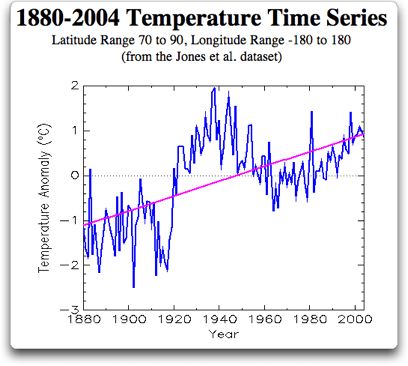
Whilst browsing the wilder shores of skepticism (well, I'd just been to Ikea and needed some light relief...) I came across the inaccurately titled "Reality in Arctic temperature trends. Scroll down about 1/4 of the way to the 1880-2004 temperature plot. So... temperatures higher in 1935-1945 than now? Interesting! And using CRU data too. How come... Well, one funny thing is that he calls this "A sobering dose of reality" - presumably forgetting that elsewhere he has attacked the Jones data as the spawn of the Devil. A second funny thing is that he is using [70,90]... [60,90] is more usual. Would you get the same results for [60,90]? And are there really many stations between [70,90] in the early period?

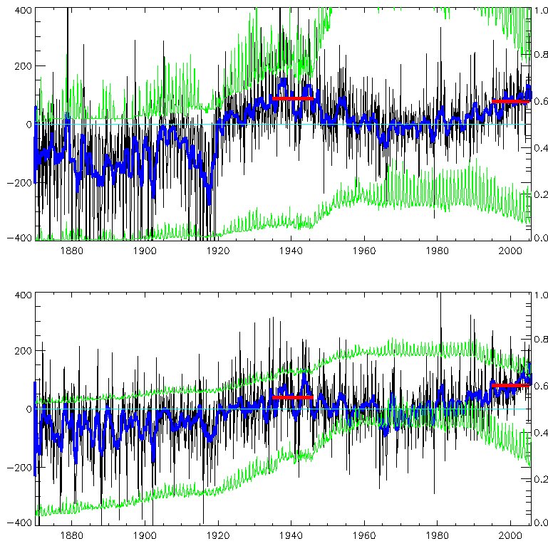
I'm sure you can guess the answers, and its "no" to both. Have a look at my pic (but be careful, there are lots of lines...). The top graph is [70,90]. The bottom graph is [60,90]. Both show the area-averaged temperature anomaly (in black; the 13-month running mean is in blue) from the HadCRUT2v dataset, in 100's of oC, which is why the left hand scale is 100 times bigger than you think it ought to be. Both plots have the same general shape, but for the wider area the current (last 10 years, mean given by red bar) temps are higher than for the 1935-1945 average. But even for [70,90] the temps in 1935-45 are only marginally higher than now - about 0.1 oC - hardly "much higher than today" as our septic claims.

But... look at the green lines. The lower green line on each plot is the fraction of the area covered by obs, on the right-hand scale. So for [60,90] about 40% of the area is observed, since 1960. In the 1940's, about 30%. For [70,90] about 20% is observed, recently (though with a huge annual cycle: far more people about in summer!) and less than 10% in the 1940's. Our septic complains that the "Arctic Climate Impact Assessment (ACIA) start their temperature records in 1960". Errm yes, well that might well be a good idea. Perhaps the ACIA people actually bothered to look at the data rather than just area-averaging it.

In fact, to my not-great-surprise, the ACIA people do indeed look at temperatures before 1960 (hint: if a septic sez something is true, its probably false...) and even draw nice maps of the trends at various time intervals: see the ACIA sci report, p36 and after. But they note the data sparsity problems early on.

The total *number* of filled 5x5 degree gridboxes is the upper green line on each plot, and the scale is (conveniently) the [0,400] of the upper half of the temperature scale (has your mind exploded yet?) *except* that for [70,90] that would be too small to see so I've multiplied it by 10 (boom!). So at the time of that huge (and rather suspicious...) jump in the upper plot at 1919, there were only 5 (=50/10) stations. For [60,90] there are nearly 200 filled boxes, recently.

Just looking at fraction-of-obs can be a bit dry, so here are maps of gridboxes filled (with their anomaly values, no in sensible units) for July 1919, 1940 and 2000. Note that using July maximises the filled boxes for the year. Its pretty obvious that 1919 is *very* sparse; 1940 is sparse; but even 2000 isn't exactly packed, north of 70; though its pretty good from 70 to 60 (oh, the black circles are 60 and 70 N, of course).

So... what do we learn from all this (apart from never trust the septics, but we knew that already)? We learn that plucking a dataset off the shelf and playing with it and only showing the end result may well mislead... we learn that you should be cautious with sparse data.

Weaselly behaviour

Via Wolfgang via CIP, I learn of Scott Adams Weasel Poll - weaseliest individual is Bush and weaseliest org is the Whitehouse. Reporting it as "finding supplies" when white people loot does creditably in the weaselly behaviour category. Though if you ask me SA can't draw weasels for toffee (his look like rats); and his weasel day mustelid is actually a ferret.

Also, this is a good recent one...

2005-11-11

Scary scaling

A while ago - back in 2002 I suppose - I heard vague refs to a paper about "scaling" which somehow demonstrated global climate models fail to reproduce real climate when they are tested against observed conditions. Since this was being posted to sci.env by the usual nutters I didn't pay too much attention, and as far as I can see neither did anyone else; though it occaisionally recurs. For one thing, the original article was published in Phys Rev Lett which I (and I think most climate folk) don't read; and pdfs weren't scattered across the web quite as freely in those days. And for another, whatever they were saying was so abstruse as to appear meaningless (even the nutters didn't push it much, because they had no idea what it was about either).

However, someone who isn't a nutter (thanks Nick! But I was right: its the Israelis) has re-drawn it to my attention, and even provided me with it on paper, so I've read it. You can too: its Global Climate Models Violate Scaling of the Observed Atmospheric Variability by R. B. Govindan Dmitry Vyushin Armin Bunde, Stephen Brenner, Shlomo Havlin and Hans-Joachim Schellnhuber. And it did get some attention: e.g. from Nature (subs req) (reputable of course, but sometimes over-excitable). But... is it any good?

Weeeeeelllll... probably not. This is yet more of the fitting power laws to things stuff. They use "detrended fluctuation analysis" (DFA) which I don't understand, but that doesn't matter, we'll just read the results. So... Govindan et al. do their DFA on observations from 6 (rather oddly chosen) stations; and 6 GCMs. The first oddness is their chosing Prague, Kasan, Seoul, Luling (Texas), Vancouver and Melbourne as represenatative of the world. Never mind. They get A ~ 0.65 for these stations. Don't worry too much about what A is; its related to the memory of the system: A ~ 0.5 is no memory (white noise); A ~ 1 is long memory (red noise). They assert boldly that this 0.65 is therefore an Universal Value. They discover that the GCMs, forced by GHGs only, by contrast get A ~ 0.5. Which, says Govindan et al., means that the GCMs overestimate the trends. Just to make sure that you won't miss this, they repeat the same at the end. But... this is not news. The fact that GCMs forced only by GHG's overestimate the trends is in the TAR (like just about everything else you need to know about climate change, its in the SPM, as fig 4). When you add in sulphates, the A from the models increases somewhat (to 0.56-0.62 ish); but thats arguably still too low. So whats up?

Which is where we turn to... Fraedrich and Blender, Scaling of Atmosphere and Ocean Temperature Correlations in Observations and Climate Models. Also in PRL. Who argue that G et al. are wrong: their Universal Value of A ~ 0.65 is not universal at all. They do a much wider analysis: instead of just a few stations, they use a gridded dataset across as much of the globe as they can. And they find (surprise!) exactly what you would expect: over the oceans, high A (~ 0.9) and over the continental interiors, low A (~ 0.5) and in between, mixed A (~ 0.65). Why is this exactly what you expect? Because the ocean has a long memory but the land doesn't. And... if you draw the same plot in a GCM (ECHAM4/HOPE) you get a remarkably similar pattern. So they come to a quite opposite conclusion: the DFA analysis actually shows the GCM performing rather well. And they conclude: The main results of this Letter follow in brief: (i) The exponent A ~ 0.65 is predominantly confined to coasts and land regions under maritime influence. (ii) Coupled atmosphere-ocean models are able to reproduce the observed behavior up to decades. (iii) Long time memory on centennial time scales is found only with a comprehensive ocean model. That last point arises because they tried the same analysis with a slab ocean and with fixed ocean; unsurprisingly, the scaling doesn't work in those cases.

F+B also picked their own seemingly odd station, Krasnojarsk, as a continental interior station, and showed (their fig 1) a scaling of A ~ 0.5 between 1y-decadal scales. At this point Govindan drops out, but some of the original authors reply, saying that (i) the scaling isn't 0.5 at K; and (ii) it isn't 0.5 at other interior points too (they pick yet another scatter of random stations). F+B reply, that (i) Oh yes it is (ii) maybe its the fitting interval: they use 1-15 years; the others are using 150-2500 days. On (i), looking at the pics, I'm with F+B and I can't see what the others are up to.

F+B, incidentally, argue that a control-run GCM (ie no external forcing) is quite good enough to get the long-timescale correlations, and that other forcing doesn't much help (for these purposes at least; you might perhaps have argued that adding in solar forcing and volcanic and stuff might help further). In Blender, R. and K. Fraedrich, 2004: Comment on "Volcanic forcing improves atmosphere-ocean coupled general circulation model scaling performance" by D. Vyushin, I. Zhidkov, S. Havlin, A. Bunde, and S. Brenner, Geophys. Res. Letters, 31 (22), L22502. DOI: 10.1029/2004GL021317 they criticise Vyushin (one of the et al. with G) for suggesting that volcanic helps, on the grounds that it simply isn't needed to get these A values right.

So after all that, what do we end up with, and what have we learnt? Assuming F+B are more right (and I think they probably are, based on what I've read so far) we've learnt very little. The fact that T increases are bigger sans aerosols is bleedin' obvious; as is the longer memoery of the oceans. We have a validation of the GCMs by another measure, but a rather abstruse measure and not an obviously useful one.

I'm an "Adorable Little Rodent"!

I've finally succumbed and got a blog counter (from blogpatrol). Its off down the side underneath the ads... I started it at 40k, which is where google adsense says I am (approximately); but now everyone can see not just me. Out of compliment to CIP (where I got the idea) I chose the same style as him. CIP also has a rather more gracious way with words than me, so I'll use his:

I would just like to thank all of you for stopping by. I'm especially grateful to those who leave a comment, even if it is just to tell me I'm wrong, crazy and or stupid! Especially if you explain your reasoning


I do indeed thank you for stopping by... but just to prove that I am less gracious than CIP I'll add comments are only welcome providing you are polite.

However the title of this post refers to my place in the TTLB ecosystem (see the sidelink somewhere) where I have moved up from "Slithering Reptile" (back in September; then, CIP was only a Flippery Fish, now he's been promoted to Crawly Amphibian!). I wonder if there is a mustelid category, though Adorable Rodent is close-ish.

2005-11-10

Timing of Dansgaard-Oeschger cycles

A tentative post this, unlike my usual strident opinions :-)

The starting point is Timing of abrupt climate change: A precise clock by Stefan Rahmstorf (GRL, 2003), and also recent RC: chaos and climate (check the comments). When I first read the GRL paper I somewhat distrusted it. I'm not sure why. The basic idea of that paper is that the [[Dansgaard-Oeschger events]], which occur with approximately 1,500 year spacings in the last glacial, really are regularly spaced, albeit with occaisional "misses". This somewhat overturns what I thought was the conventional wisdom, which is that the D-O events are responses to the Laurentide ice sheet internal instabilities, or somesuch, and if so would only be quasi-periodic.

One problem with that view is that if they *are* truly on a clock, then that probably requires an astronomical clock, nothing on earth being regular enough. In todays Nature Braun et al (inc Rahmstorf) propose a Possible solar origin of the 1,470-year glacial climate cycle demonstrated in a coupled model which they get from combinations of the De Vries (210) and Gleissberg (86.5) cycles. I only mention that to draw it to your attention; I have no opinion as yet.

You only get the nice 1,470 spacing if you use the GISP core, and only for the first 50 kyr of it. Which is maybe why I was suspicious... it smacked of choosing your data carefully. But now, having overplotted this stuff a few times, I've come to appreciate that the GISP and GRIP timescales aren't the same. And (so it is claimed) the layer counting for the first 50 kyr of GISP makes it most accurate. Quite likely.

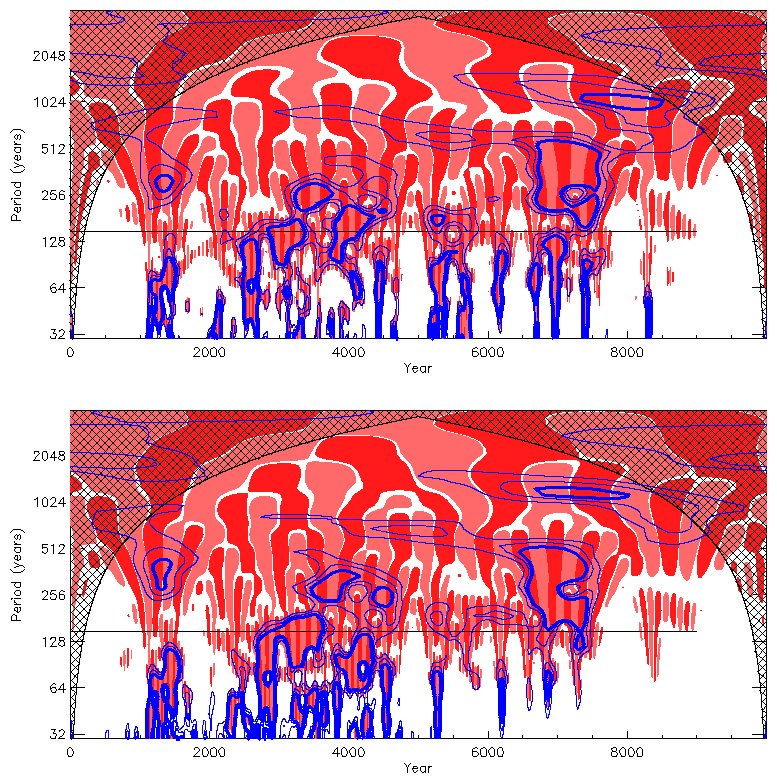
My own little contribution is the plot here. Sorry about the garish colours. Its a [[wavelet]] decomposition of the same delta-O-18 data. To do that I had to regrid the data onto a regular 10 year time grid, which is why that plot is lying about the timescale: for "year" read "decade". One plot is GISP. The other is GRIP. I forget which: if you really know your data you can discover which is which. Your clue, if you need one, is to look near the 40 kyr date. However, on this plot at least, GRIP and GISP look fairly similar. My own view is that on this view, the data looks quite noisy.

Errm, and thats it for now. Sorry there's no conclusion!

Rabett vs Pielke

Not everyone reads comments, so I point you to some interesting stuff in the latest RC post, in particular this by Eli Rabett criticising RP Jr's position: What you are doing here, and in your publications, and on Prometheus is to assert ownership of a series of issues, the latest of which is hurricane damage due to climate change. Your incessant self citation is a clear indication.... Strong stuff, and there is more. I look forward to the extended exchange.