Landsea, Trenberth, Connolley... the list of famous scientists drawn irresistibly to draw trend lines through hurricane numbers grows. Anyway, this follows some recent stuf on sci.env. I found Atlantic Storms
sorted by Year (1851-2002), extracted the raw data, and plotted it. I have concerns though: it seems to me that there might be biases in missing early storms. And indeed if you look at the East Pacific page, it seems there are early biases that they warn you of. But they don't warn about the Atlantic numbers. So lets trust them, at least for these porpoises.
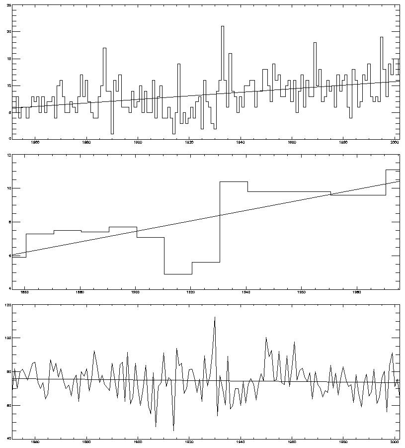
So we get the
[A word about stat sig: as two comments pointed out (thanks) I was being naive about the sig: you need to take autocorrelation of the data into account. I know this full well, but I was in a hurry. To do this, you can (a) do it properly (deflate the d.o.f.) or (b) try averaging the data for a longer period. Thats what the middle pic is: I've averaged it for 10 year periods, so the autocorr mostly disappears. And the trend stays sig now.]

But... if you look closely, it looks like there is a jump in numbers in 1920-1930 ish, perhaps? So, I ran it through my jump-detection software (Reference: Lund and Reeves, J Climate, p2547, 2002) and get... this pic. Top graph is the "is-there-a-jump" function, which intersects the line of 95% probability, so yes it thinks there is. Bottom graph is the softwares best guess at the jump point, and trend lines before and after assuming a discontinuity there. The software thinks the jump is between 1930 and 1931. The trend, from 1931 on, is not significant any more [and nor is the pre-1930 trend. Note that this *can* be trusted, even with autocorr: taking into account the corr would only make it even less sig]. Its interesting that the software picks up the jump that my eye (at least) does. And I *didn't* run the software first and then decide on a jump: I looked at it by eye, thought "hmm I wonder what the software sez" and lo!, we agree.
What, if anything, does this mean? Probably, not very much. You'd need to be far more careful about homogenising the data, and checking back to the sources, if you were to take this seriously. You might want to see what happened around 1930 to observing practices, ship movements, etc, around there. This is just for fun.
6 comments:
That broken trend line is clearly wrong (the pre-1930 bit). Also, the "statistically significant" is bogus, as I will attempt to explain on sci.env (briefly, the residuals are not independent).
As James implies, autocorrelated series can create all sorts of problems for time-series analysis (particularly as the autocorrelation coefficient tends towards 1). An R^2 in the high nineties is more often a sign of a problem than it is a sign of a good regression. However, it doesn't look like you have a severe autocorrelation problem here (your stats program should have a canned test for this - if not, save the residuals and regress them on their first lag and look at the significance of the coefficient.)
You may however, have a problem with your break test. If it is a Chow test then repeated application of it messes up your critical values (at the simplest, if you repeat the test 20 times with a 95% critical value then you are likely to find at least one break that isn't there).
More generally, humans are amazing a pattern recognition. Unfortunately, this leads to seeing patterns that aren't there. While statistical tests can ameliorate this tendency, they are still more likely to mislead than illuminate unless handled carefully.
I've revised the post. JA was right about the trend line. You're both right about stat sig, though the 10y avg mostly cures this.
The breaks are done with an algorithm from Lund - dunno about Chow. There is no repeated application: it just fits regression lines to the first and second portions of the series, and moves the break point through the series. The test (from my memory) is then based on the fit of the two lines vs a single one, and the stats for that are empirically generated.
If you discard the early data (presumably due to unrecorded events) then try to fit a line which (instead of being straight) has the same shape as SST over the period, do you get a better fit. Could that be statistically significant?
Chris Randles
Knowing how much of the early data is reliable is why you need an expert to work on this, not just someone who picks up the data and plays with it, like me!
Relating it to SST is an idea; its on my list and may even get to the top of it sometime...
My suggestion is pick a set of weather stations that existed back to 1850 in the Carribean, Mexico and the US. Only count hurricanes that were observed in those areas. Obviously not a job for an evening, but you should get an estimate that is unbiased by false negatives.
Post a Comment