 The recent Fred Singer Op-Ed in the WSJ has drawn ire from just about everyone, because it was stupid. I'm guessing the WSJ didn't realise how dumb it was when they published it; they may have thought good ol' Fred was a reliable pair of hands, though why they'd think that I don't know.
[My apologies for the absence of the picture. The link, you'll see, is to https://michaelmann.net/sites/default/files/Screen%20Shot%202018-05-21%20at%205.09.56%20PM.png which existed when I wrote the post, but has subsequently been removed. I hate it when people do that.]
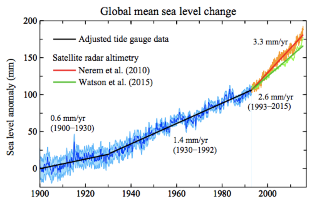
Aanyway, I wanted to discuss this pic, which seems to be popular for refuting the Fredster. Mann uses it (somewhat carelessly without attribution; and, now I look closer, merely as a visual: nothing in the text refers to it); ATTP is more careful, and sources it to Hansen et al. 2016. But while ATTP is careful with his sourcing, he is somewhat careless with his phrasing, since the figure apparently shows sea level rise is indeed accelerating. SL is definitely rising; it may be accelerating, but does the figure show that? It shows a long-term trend from tide gauges to 1993, and then a different - well, two different - rates from 1993, from satellite altimetry.
Having two different rates is the first and obvious problem. One of them is wrong, since they appear different enough to be incompatible. As science-in-progress that's fine; SL is rising whether it's rising at 3.3 or 2.6 mm/yr; but putting such a picture up as proof to the general public that you know what you're doing is odd (labelling another, whose data clearly extend past 2010, as "Nerrem et al. (2010)" is also going to confuse thinking people who don't understand the habit of extending datasets according-to-the-method-of, which I assume is what happened in this case).
Oh, lordy, and now I look the Hansen paper the figure comes from is that Hansen paper. But that does allow me to find the caption: "Figure 29. Estimated sea level change (mm) since 1900. Data through 1992 are the tide-gauge record of Church and White (2011) with the change rate multiplied by 0.78, so as to yield a mean 1901–1990 change rate of 1.2 mm year−1 (Hay et al., 2015). The two estimates for the satellite era (1993–2015) are from Nerem et al. (2010, updated at http://sealevel.colorado.edu) and Watson et al. (2015)." The scaling by 0.78 stands out as an interesting point, which Hansen et al. justify with "Hay et al. (2015) reanalyzed tide-gauge data for 1901–1990 including isostatic adjustment at each station, finding global sea level rise to be 1.2 ± 0.2 mm year−1. Prior tide-gauge analyses of 1.6–1.9 mm year−1 were inconsistent with estimates for each process, which did not add up to such a large value (Church et al., 2013)". I'm not going to complain about that, just point out that This Stuff Is Not Simple.
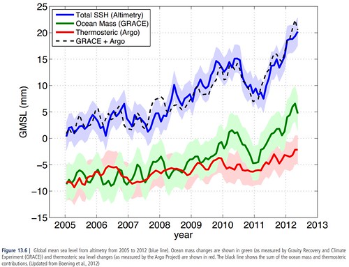 Kinda nice is this pic from AR5, which shows that changes in ocean mass (from GRACE) i.e. the land-ice-loss and stuff, plus changes due to temperature, about add up to what we see. From eye, the blue altimetry line is 20 mm in 7 years is 2.6 mm/yr, i.e. the green line in the previous pic.
The other obvious point is that the "acceleration" - actually, as presented, change from one linear trend to another - occurs when you switch the dataset from tide gauges to altimetry. It doesn't take much wit to ask: "I wonder if the change is real, or caused by the change of measurement method?" FWIW, if you were going to wonder which was more accurate, I'd go for the altimetry (the case is not analogous to temperature measurement): tide gauges are not global (they tend to be on the edges of landmasses, oddly enough) and require many complex corrections for isostatic rebound; though satellite altimetry isn't absolute either.
Refs
* ATTP links this in the comments, but here (as proof of it's high profile :-) is Gavin's tweet showing that Climate-change–driven accelerated sea-level rise detected in the altimeter era by R. S. Nerem et al., 2018, is yer Top Source for "SLR is accelerating".
* Sea Level Data: Church & White, or Jevrejeva et al.? - Tamino.
7 comments:
Sorry, you got beaten to it by your old friends.
Oh noes, I knew I should have written faster. Never mind. While WE points out some things, as usual he gets others wrong. "In Figure 29 of that paper, Hansen claims to show that sea level rise has been accelerating" is, AFAIK, wrong. That's how ATTP used it, but Hansen doesn't. He also claims Hansen is "flattening the record and thus reducing the prior sea level trends … which of course makes it seem like there is more acceleration than might actually exist". But that only makes sense if H is looking for acceleration. If he isn't, then it also has the effect - which WE strangely neglects to mention - of reducing prior SLR.
Maybe I should have been more careful and said something like "probably" but unless I'm missing something, it's seems reasonable to interpret that graph as suggesting that sea level is rising faster today than it did earlier this century (and faster than the 20th century average). The claim being made in the article was that it hasn't changed. I guess one could test the null hypothesis of "there has been no change in the rate of sea level rise", which I think one would reject (although, admittedly, I haven't done the formal statistical analysis). I believe there are also other indicators that sea level rise is accelerating (here, for example, but maybe a bit old).
There also appears to be a recent paper suggesting that sea level is accelerating at 0.084 +- 0.035mm/y^2. This also appears to be based only on the satellite data, which is somewhat different to what I was suggesting (it appears to be faster now than it was before).
>"In Figure 29 of that paper, Hansen claims to show that sea level rise has been accelerating" is, AFAIK, wrong. That's how ATTP used it, but Hansen doesn't.
It's kind of ambiguously non-committal about the graph, but the text referencing it does say the rate of sea level has increased:
We do not argue for the details in Fig. 29 or suggest any change points for the rate of sea level rise, but the data do reveal a substantial increase in the rate of sea level rise
Though, as you say, if they were particularly interested in emphasising acceleration, they could have done a much better job.
---------------------------
>But that only makes sense if H is looking for acceleration. If he isn't, then it also has the effect - which WE strangely neglects to mention - of reducing prior SLR.
Maybe you didn't get the memo? "Skeptics" don't care about the magnitude of 20th Century SLR anymore. In fact, the more the merrier. Everything is now about acceleration.
---------------------------
I think part of the issue is a confusion over what is meant by acceleration. Some of that is because "skeptics" generally want to be confused. But also many of the early mainstream assessments (such as the infamous Munk's enigma) tended to focus only on GHG forcing, with the result of a very clear expected acceleration during the 20th Century, and more recent assessments (e.g. AR5) have continued to imply importance of 20th Century acceleration.
The thing is though, when you simply add in natural forcings - in particular the shift from very strong 19th Century volcanic forcing to a quiet period up to 1960, increased solar forcing in the early 20th Century, then resumption of volcanic forcing in the late 20th Century - the result is a much weaker expectation of only slight acceleration. When you further add in uncertainty over anthropogenic aerosol forcing, it's quite plausible that we would expect to see deceleration over the 20th Century.
Acceleration during the 20th Century simply isn't a robust expectation of current climate science, yet that's what many seem to want to test. As far as I can see the two main robust expectations are:
1) Faster 20th Century rate than the average of the past millennium or so
2) A faster rate over the past 30-odd years than the 20th Century average
Both these check out as far as the available evidence goes.
> reveal a substantial increase in the rate
Ah. You actually read the paper. I only ctrl-f'd for "acceleration".
I find myself uninterested in the acceleration. I'm inclined to think it is there, but not to care very much. ATTP's paper reffed does indeed make a better case. But somewhat missing is what acceleration you'd actually expect. It makes some vague comparison to GCM results, but it's rather half-hearted.
Also relevant is this discussion paper:
https://www.earth-syst-sci-data-discuss.net/essd-2018-53/essd-2018-53.pdf
Figure 3 shows the rate of SLR over the satellite period, and I think one conclusion of the paper is that observed acceleration has been about 0.1 mm/year/year, roughly consistent with the Nerem paper that ATTP references. The paper also does a nice job of attributing SLR to various components (thermal, ice sheets, glaciers, impoundment, etc.)... though, in a major oversight, they leave out the Cliffs of Dover.
Regarding 20th century SLR: I generally prefer the Hay/Kopp approach (https://www.nature.com/articles/nature14093.pdf). I will note that as far as I understand it, the tide gauge approach and the satellite approach actually agree reasonably well in terms of post-1990 sea level rise: I think the apparent rate change there is a visual illusion resulting from the two linear fits. In any case, Figure 4 of Hay et al. 2015 is the most useful for understanding how the rate of sea level rise has changed over time. The peak in the 1940s is what confuses some contrarians, as they seem to be under the impression that if the climate has ever changed naturally, then we can't attribute modern changes to anthropogenic influences. Hay et al. found a smaller 1940 peak than some other papers - these other papers (in particular, Jevrejeva et al., whose methodology was critiqued by RC) were what led the IPCC to (erroneously, IMO) state that the 1920-1950 rate of SLR was likely as large as present-day (I think it was likely less, though maybe not "very likely").
It sounds like you are also be interested in the "expected" SLR question: Kopp et al (http://www.pnas.org/content/pnas/113/11/E1434.full.pdf) gets a bit at this, finding that at least 40 percent, and possibly more than 100 percent, of the 20th century sea level rise is due to anthropogenic factors.
-MMM
Post a Comment