Anyway, I've done a few more pics: here are maps of the trends (1979-2004, from annual mean data) from S+C vn5.2, 5.1, RSS and 5.2-5.1:

The last is quite startling, to me: it looks like an essentially zonally symmetric correction in the tropics. Odd.
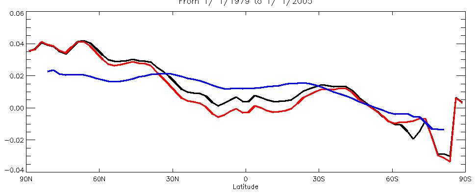
And then the zonal means of the trends:
Also interesting (perhaps) is the trends to-year for the two series:
year  5.2     5.1
1992  0.0009 -0.0005
1993 -0.0025 -0.0046
1994 -0.0017 -0.0045
1995  0.0015 -0.0014
1996  0.0021 -0.0008
1997  0.0028 -0.0001
1998  0.0099  0.0070
1999  0.0089  0.0058
2000  0.0080  0.0046
2001  0.0090  0.0054
2002  0.0108  0.0072
2003  0.0117  0.0080
These are the trends calc from the monthly data, from jan 1979 to dec of (year). They aren't quite the same as the ones on the wiki page (for 5.1) but thats probably down to minor processing (my area avg vs theirs, perhaps). So on my version of their v5.2, the negative trends stop in 1994, 3 years earlier than for 5.1.
Meanwhile... over at Deltoid, Scott Church commented: Note that these are TLT trends, so they won’t compare directly with current versions of RSS MSU trends which are for the middle troposphere (the corresponding UAH trends for an RSS or Prabhakara comparison will be TMT). I'm actually a teensy bit confused about the various products and levels. The S+C vn5.1/5.2's are definitely comparable. The RSS data may not quite be. The RSS stuff is their TMT product, which is a merge of MSU channel 2 and some AMSU data.
2 comments:
Although I don't exhibit other obvious signs of masochism, I periodically visit Tech Central Station to see what the Dark Side is currently spouting. Just now I found this interesting squib from Roy Spencer: http://www.techcentralstation.org/062005G.html posted on May 20th. Given that it must have been written around the same time he became aware of the need for the satellite revision, one has to wonder what he was thinking.
When I was getting my Engineering Degree, my papers were routinely marked up in red anytime I did any "zooming" of data to make it look pretty.
I look at all of the climate "anomalies" graphs and wonder if any of the science professors ever get their red pens out. Showing "anomalies" might be reasonable, but only if the raw data is also displayed. Personally I would prefer to see the graph in deg K starting at 0 K (or R if you prefer), but such transparency seems to be lost of climate researchers seeking more funds. The worrisome aspects of climate change become rather difficult to see when put in perspective.
Of course this is why my Professors kept marking up my work in this particular area. Maintain perspective so you make good decisions.
Every time I see an Anomalies graph published without a contextual Temperature graph next to it, my BS meter gets pegged.
This has been created by the Excel Generation of scientists (AKA Spreadsheet Man). I hope that rationality returns to the sciences eventually, but I am not hopeful with the nonsense that abounds today.
Post a Comment